


Table of contents
Correlation
Relationship between two variables
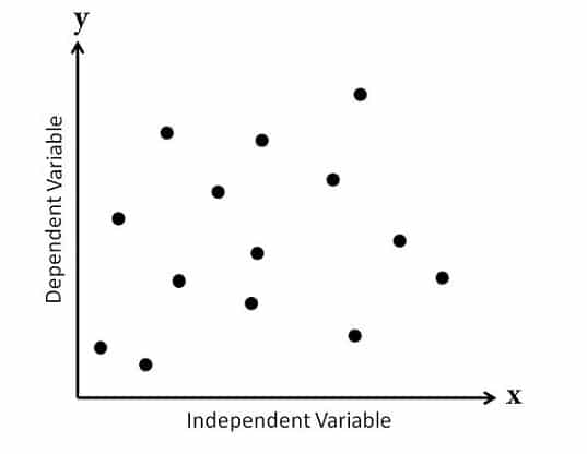
x = explanatory/independent variable
y = response/dependent variable
Correlation coefficient
Quantifies the linear relationship between two variables
Number between -1 and 1
Magnitude corresponds to strength of relationship
Sign (+ or -) corresponds to direction of relationship
The closer the correlation value to zero the weaker the correlation
Visualize relationships
import seaborn as sns
sns.scatterplot(x="sleep_total", y="sleep_rem", data=msleep)
plt.show()
Adding Trendline
By adding a trendline it can help us to easily find a correlation between two variable
import seaborn as sns
sns.lmplot(x='sleep_total', y='sleep_rem', data=msleep, ci=None)
plt.show()
Calculating correlation
msleep['sleep_total'].corr(msleep['sleep_rem']) # Out: 0.751755

msleep['sleep_rem'].corr(msleep['sleep_total']) # Out: 0.751755
Correlation between x and y == correlation between y and x
Relationship between variables
#1.
# Create a scatterplot of happiness_score vs. life_exp and show
sns.scatterplot(x='life_exp', y='happiness_score', data=world_happiness)

# Show plot
plt.show()

#2.
# Create scatterplot of happiness_score vs life_exp with trendline
sns.lmplot(x='life_exp', y='happiness_score', data=world_happiness, ci=None)

# Show plot
plt.show()

#4
# Correlation between life_exp and happiness_score
cor = world_happiness['life_exp'].corr(world_happiness['happiness_score'])

print(cor)
Correlation caveats
Correlations only account for a linear relationship
Always visualize data when possible
xis correlated withydoesn't meanxcausesyApply log when data is highly skewed, we can apply
np.logtransformationOther Transformation:
Log transformation (
log(x))Square root transformation (
sqrt(x))Reciprocal transformation (
1/x)Combination of these, e.g.:
log(x)andsqrt(y)sqrt(x)and1/y1/xandlog(y)
Why use transformation?
Certain statistical methods rely on variables having a linear relationship
Correlation coefficient
Linear regression
What can't correlation measure?
#1
# Scatterplot of gdp_per_cap and life_exp
sns.scatterplot(x='gdp_per_cap',y='life_exp',data=world_happiness)

# Show plot
plt.show()

#2
# Correlation between gdp_per_cap and life_exp
cor = world_happiness['gdp_per_cap'].corr(world_happiness['life_exp'])

print(cor)
Transforming variable
#1
# Scatterplot of happiness_score vs. gdp_per_cap
sns.scatterplot(x='gdp_per_cap', y='happiness_score',data=world_happiness)
plt.show()

# Calculate correlation
cor = world_happiness['happiness_score'].corr(world_happiness['gdp_per_cap'])
print(cor) # Out: 0.727973301222298

#2
# Create log_gdp_per_cap column
world_happiness['log_gdp_per_cap'] = np.log(world_happiness['gdp_per_cap'])

# Scatterplot of happiness_score vs. log_gdp_per_cap
sns.scatterplot(x='log_gdp_per_cap',y='happiness_score',data=world_happiness)
plt.show()

# Calculate correlation
cor = world_happiness['log_gdp_per_cap'].corr(world_happiness['happiness_score'])
print(cor) # Out: 0.8043146004918288
Does sugar improve happiness?
#1
# Scatterplot of grams_sugar_per_day and happiness_score
sns.scatterplot(x='grams_sugar_per_day', y='happiness_score',data=world_happiness)
plt.show()

# Correlation between grams_sugar_per_day and happiness_score
cor = world_happiness['grams_sugar_per_day'].corr(world_happiness['happiness_score'])
print(cor)
Design of experiments
Controlled experiments
Participants are assigned by researchers to either a treatment group or a control group, e.g. A/B Testing
Treatment group sees an advertisement
Control group doesn't
Group should be comparable so that causation can be inferred, if not could lead to cofounding (bias)
Best practices
The best practice of experiments will eliminate as much bias as possible.
- Less bias is more reliable
Tools
Randomize controlled trials
Participants are assigned to treatment/control randomly, not based on any other characteristics
Choosing randomly helps ensure that groups are comparable
Placebo
Resembles the treatment, but has no effect
Participants will not know which group they're in
Double-blind trials
Person administering the treatment/running the study doesn't know whether the treatment is real or a placebo
Prevent bias in the response and/or analysis result
Observational study
Participants are not assigned randomly to groups
- Participants assign themselves, usually based on pre-existing characteristics
Many research questions are not conducive to a controlled experiment
Establish association, not causation
Longitudinal vs cross-sectional studies
Longitudinal studies
Participants are followed over a certain period to examine the effect of treatment response
Effect of age on height is not cofounded by generation
Expensive and take a longer time
Cross-sectional studies
Data on participants is collected from a single snapshot in time
Effect of age on height is cofounded by generation
Affordable and take a shorter time